Contents Page
- Mara Nechifor

- Apr 6, 2021
- 1 min read
Updated: May 17, 2021


THE TITLE PAGEFor the title page I wanted a relatively simple picture, the one I chose was this picture of victor, where his back is facing the camera, I thought this was an interesting photo to use as his pose fits well into the page and looks interesting. As you can see in the first picture that is displayed above, I tried making the photo different sizes, and I chose that the one where the photo was smaller and has a white border. (it looks simplistic and the main idea was to keep the contents page simple) For the title, I tried out a couple different fonts and switched through the different boldness levels. I had some trouble deciding on the one I liked the most, however you'll see in the last imagine which on I settled with.
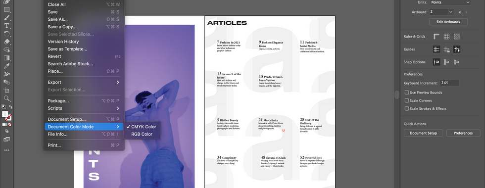
THE CONTENTS PAGEWhen we all started making the contents page we collectively decided that we would all use a pattern of our 'a' (from our masthead) in the background. We all have similar contents pages as we all used the same contents page for inspiration 'Atlas Magazine Winter 2016'.
As for the titles, I invented names that I thought would tie in and go well with the overall theme of the magazine. This magazine is based on fashion and youth culture, therefore I came up with names for the articles/editorials
FINAL RESULT


Comments