Coursework Development - DigiPak & Social Media Page
- Mara Nechifor

- Apr 11, 2022
- 3 min read
Updated: Apr 30, 2022
Digi Pak
Final Photos
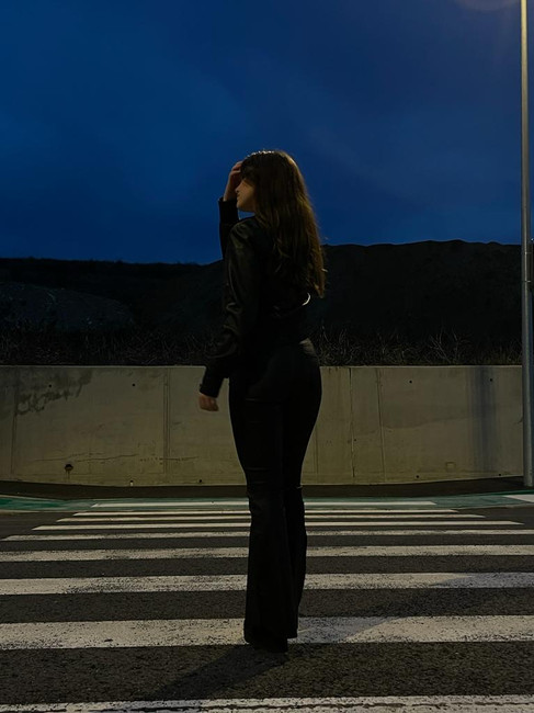
After a lot of time spent choosing the final photos, I have settled on 2. I chose two because one of them will be on the front cover and the second will be on the back cover. The first one displayed below will be the front cover. I will edit it in a very colorful way and completely transform the photo into an exciting cover. The second photo will be edited in a different color for contrast. However, the two images will complement each other and impact the audience's eye.


Editing process
What app did I use to edit the photos?
Lightroom by Adobe.
I really like using Adobe lightroom to edit photos, because it is very simple to use and can completely transform and give life to your photos. The app has a very professional feel to it, while still being easy to use.
front cover:
As you can see below, I completely transformed this photo by changing its color to bright pink. I also played around and experimented with the different settings in Lightroom, changed the exposure, contrasts, colors, etc.
I am very pleased with the result.

back cover:

Final Edits:


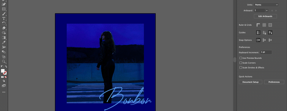
After editing the photos I used Adobe Illustrator and Photoshop to create the final DigiPak mockup. Below, you may scroll through my editing process, and you may access the final version of the mock up here.
Creating the artboards in Illustrator was relatively easy as I am familiar with doing so. I made a square artboard, placed the jpg on top of it, and then added my text and final details on top. This part of the process, when I was choosing the font for the title 'bonbon' I decided to go with the bolded text, and instead of leaving it simple, I added a shadow of the text behind it for illusion and depth. My attention to detail plays a massive role in this as it helps with making the Digipak appealing and eye-catching.
Since I liked the font used for the artist's name, I decided to use it for the back cover, as seen below. This was because I wanted to create come contrast between the two covers.
Fonts for the Digipak:
Bold text font : SteelfishRg-Bold
Cursive : Creattion Demo


Final Part of developemnt of the DigiPak was putting it into a preset mockup in photoshop. I had used the same mockup I used for my preliminary work because I like how it looked in a Vinyl format and one CD mockup which Antonia had found.


Social Media Page
The social media page that we created mainly consists of behind-the-scenes posts, the sole purpose of this was to keep our audience interested and invested. We posted ever so often to keep our audience engaged in our process. We tried making our page interactive and appealing.
You may access our Instagram page here:


The first post we published was with the intent of having our brand established. We posted a photo of our Logo and Team name so that from then on, our name is recognisable. We provided a short description of the project and let the audience know that more posts will be published soon.
After creating the first post on our instagram page, Antonia and I started selecting behind the scenes videos and images to upload to our page. These posts will help us involve our audience in the project by giving them an idea about how the final music video will look like.

Furthermore, to keep our audience informed on details such as who is editing/creating the music video and who is modelling in the video, we created story highlights where they could inform themselves on this.


Comments