Planning- MastHead
- Mara Nechifor

- Sep 20, 2020
- 2 min read
Updated: May 18, 2021
Process & Decision
My team and I, decided that we wanted to choose a simple word that has deep meaning which would then match our magazine theme ideas. We had decided that we wanted to create a youth and fashion magazine therefore we agreed on the name 'Flair' which means 'stylishness and originality'.
This process was relatively easy, even though we made a long list of possible names we could potentially use as our magazine's name.
The list below shows our brainstorming for names.

The making of the Logo/MastHeadHours upon hours were spent on what our logo should look like. We began with some doodling with a simple pen and a paper, and some inspiration off of Pinterest.

We all started drawing some rough drafts of what we want our logo to look like. This part of the process was fun however a bit challenging for me, because I, unlike the rest of my teammates, don't know how to draw very well.. They all have taken art as one of their AS subjects whereas I have never had a passion for drawing.

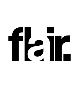
We originally loved Irina's idea with the rounded text so we decided to move onto making a digital version of our logo, Ana M taught us how to work on Adobe Illustrator and how to draw on it. We used Irina's doodle as our guide and we perfected it. After playing around in illustrator, we decided that the rounded Flair logo didn't suit what we had in mind for our magazine. We want something bold and we came to a common conclusion that it wasn't bold enough. We continued experimenting with the app and decided we liked the idea of having a 'missing letter' we tried it out with a missing 'I' and ended up deciding that a missing 'A' would be better suited.
(THE MISSING LETTER COULD ALSO COULD BE SCATERRED THROUGHOUT OUR MAGAZINE AND BE USED AS THE LETTER EVERYONE RECOGNISES.)


You can see above that we implemented some red, however for our final logo we decided to keep it black and white, however, it is everyone's choice, my teammates may decide that making the masthead a different colour suits them better.
Final LogoWe decided on two versions of our logo/masthead. We came to a common agreement that it would be our individual choice on which version we use for our separate issue's. This would depend on the complexity of our photos chosen and whether or not they match the logos.
The logo with the missing 'A' is simpler than the one with the 'A' that's filled however they're similar enough for us to use and be recognisable for our audience.


Comments